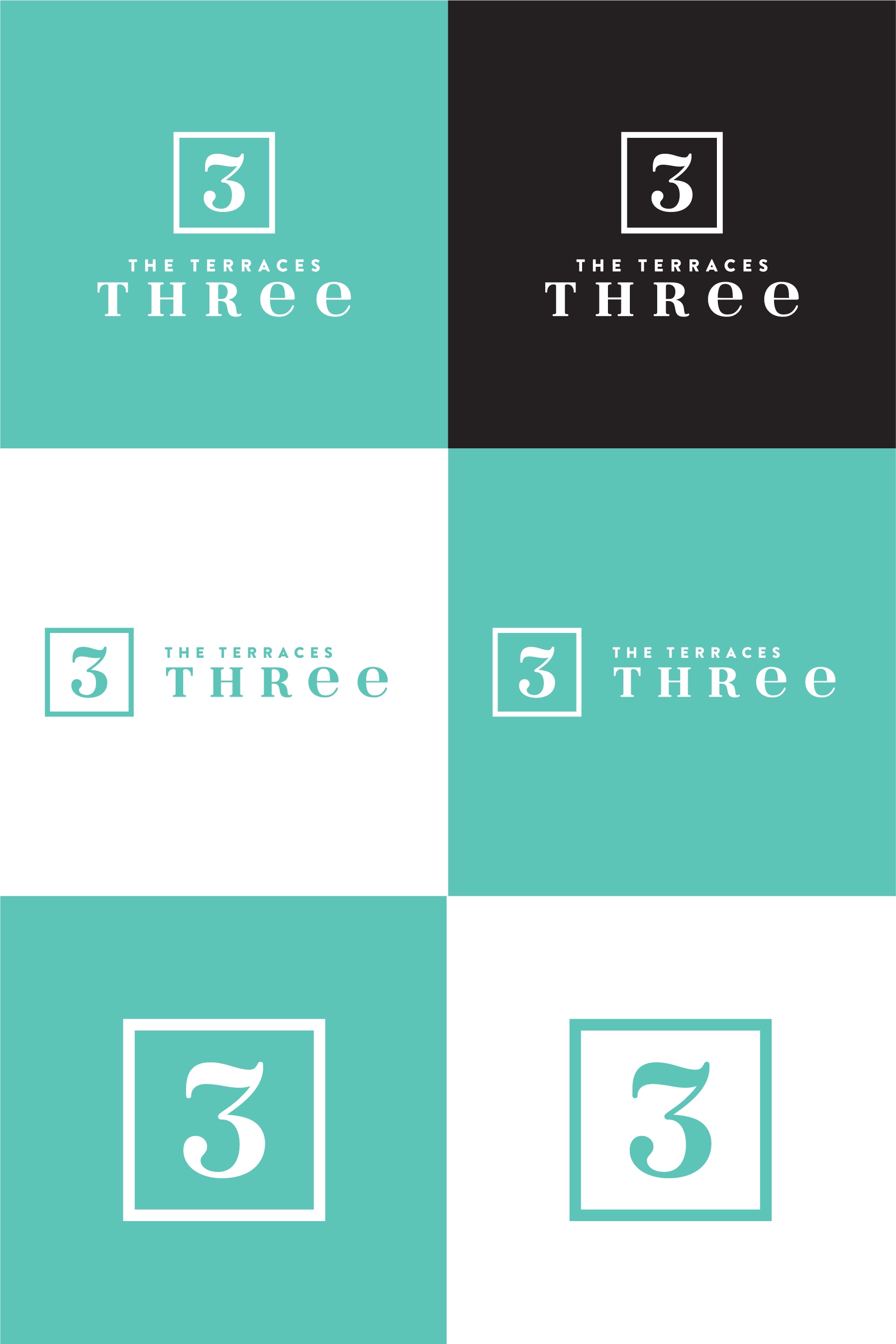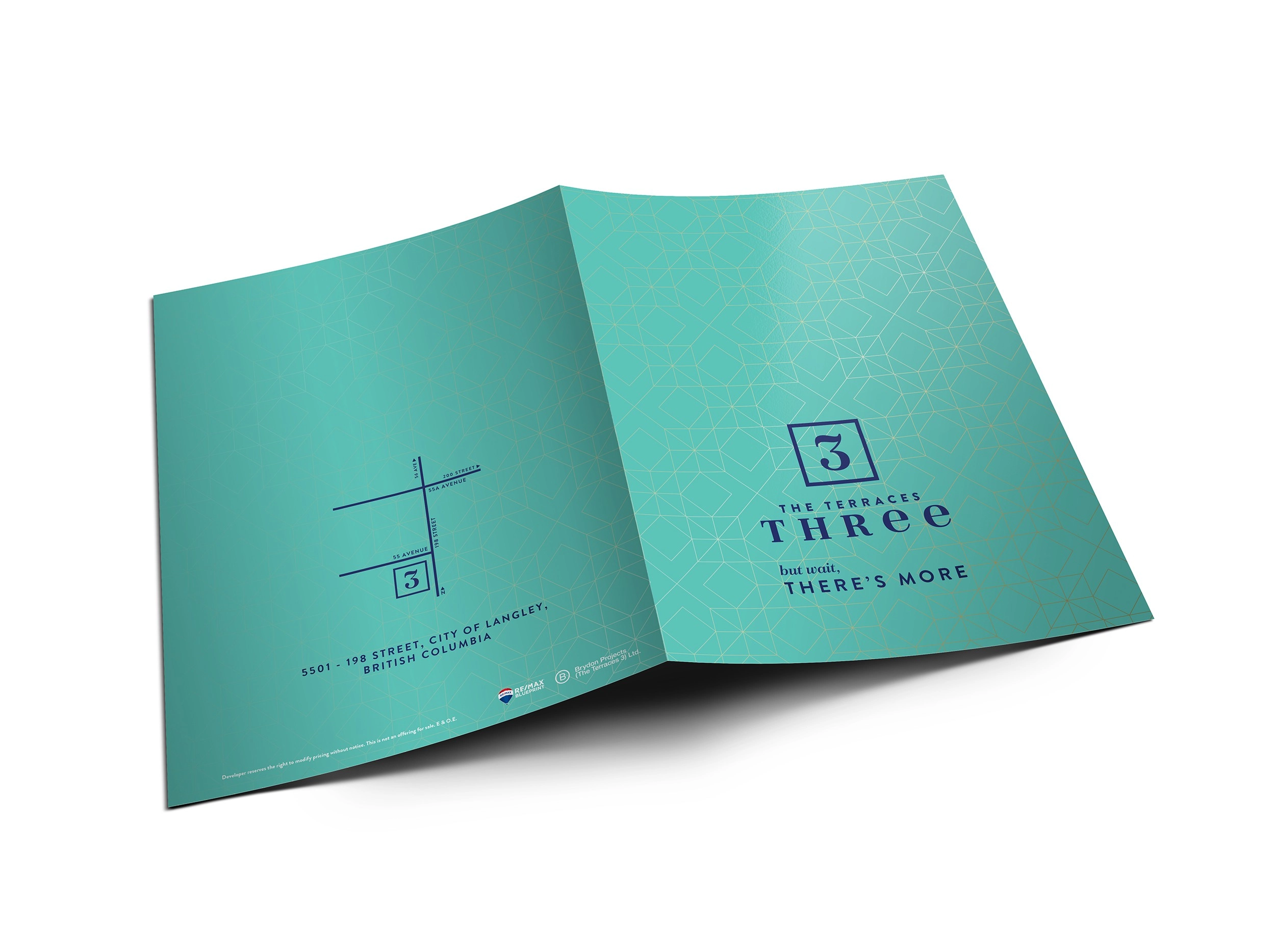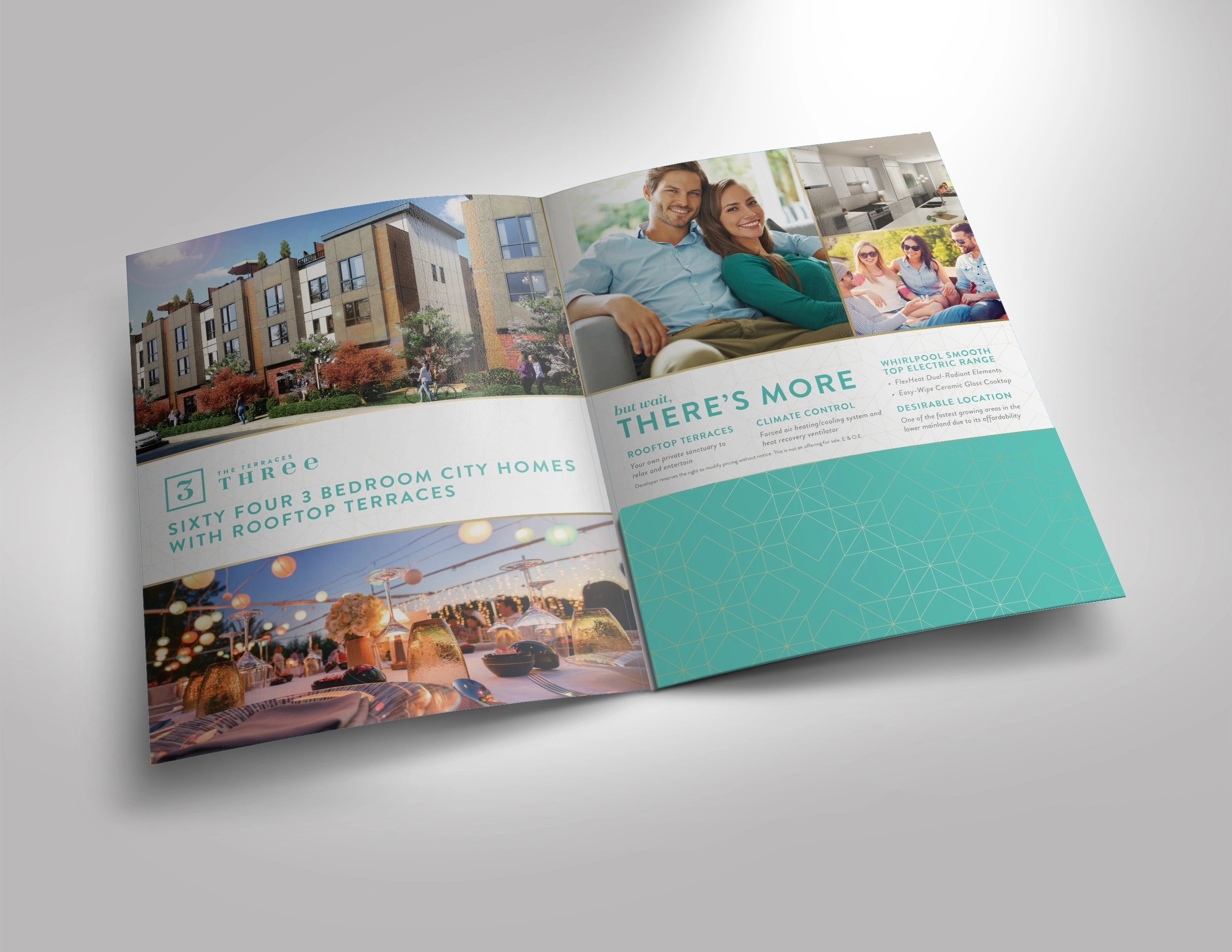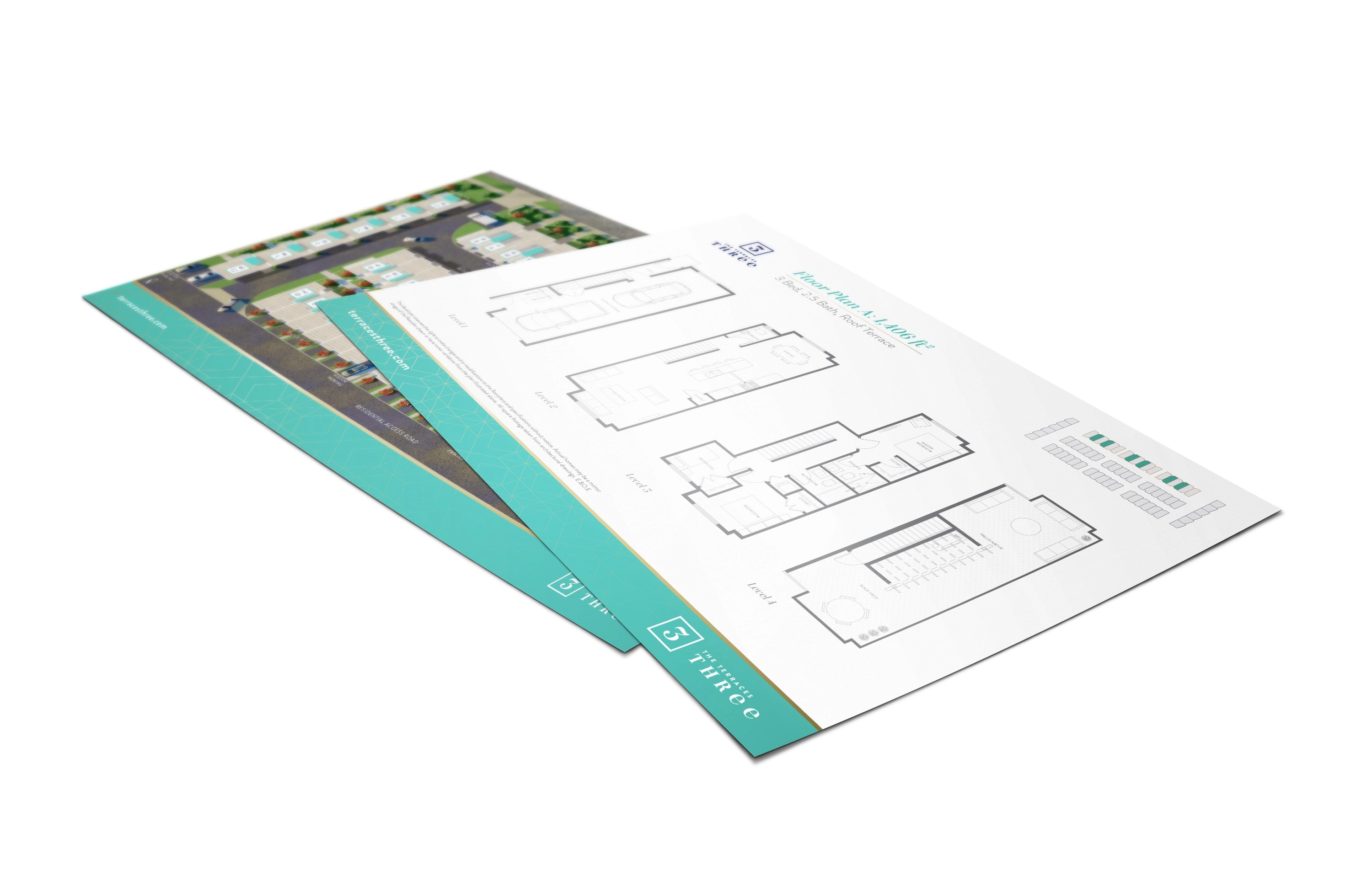
Terraces Three
The third phase of the Terraces project had changed ownership,
making the perfect opportunity to give the brand a refresh. One of the
most frequent criticisms I had heard from the original projects was that
the design was too dark, but I was limited by several design parameters that I had to work within.
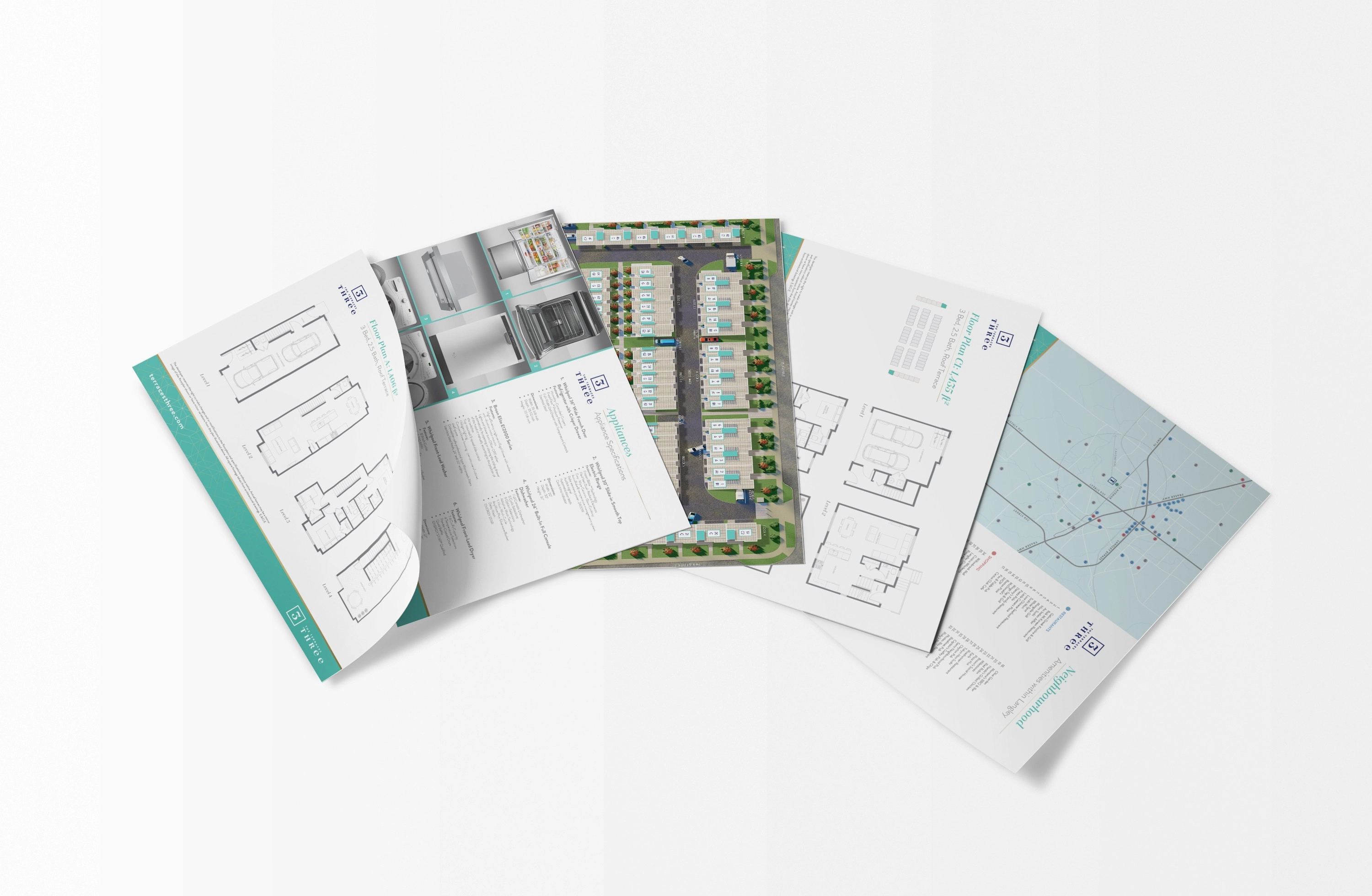
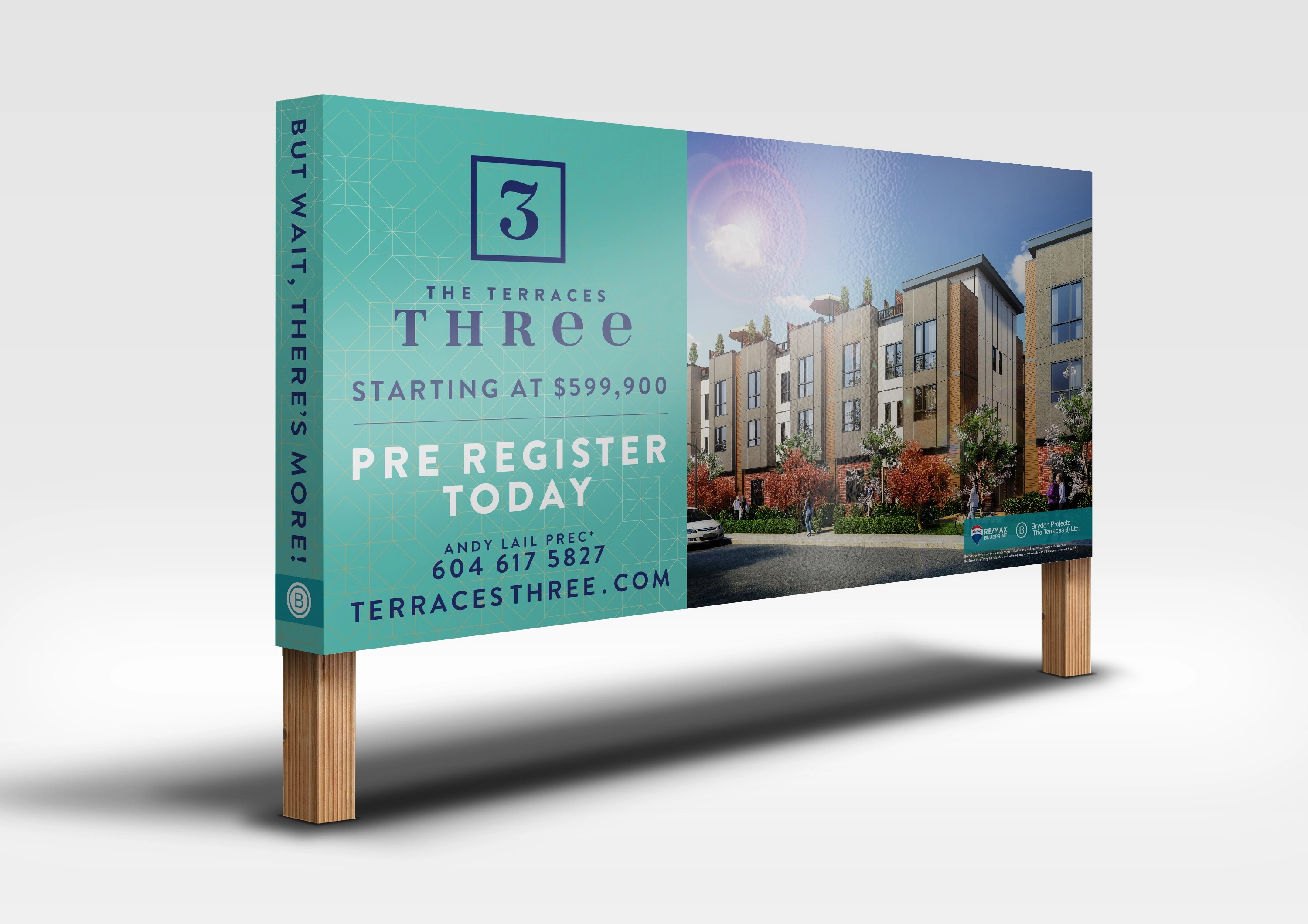
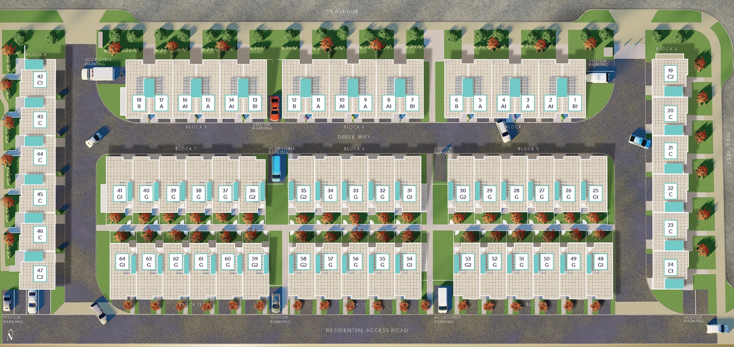
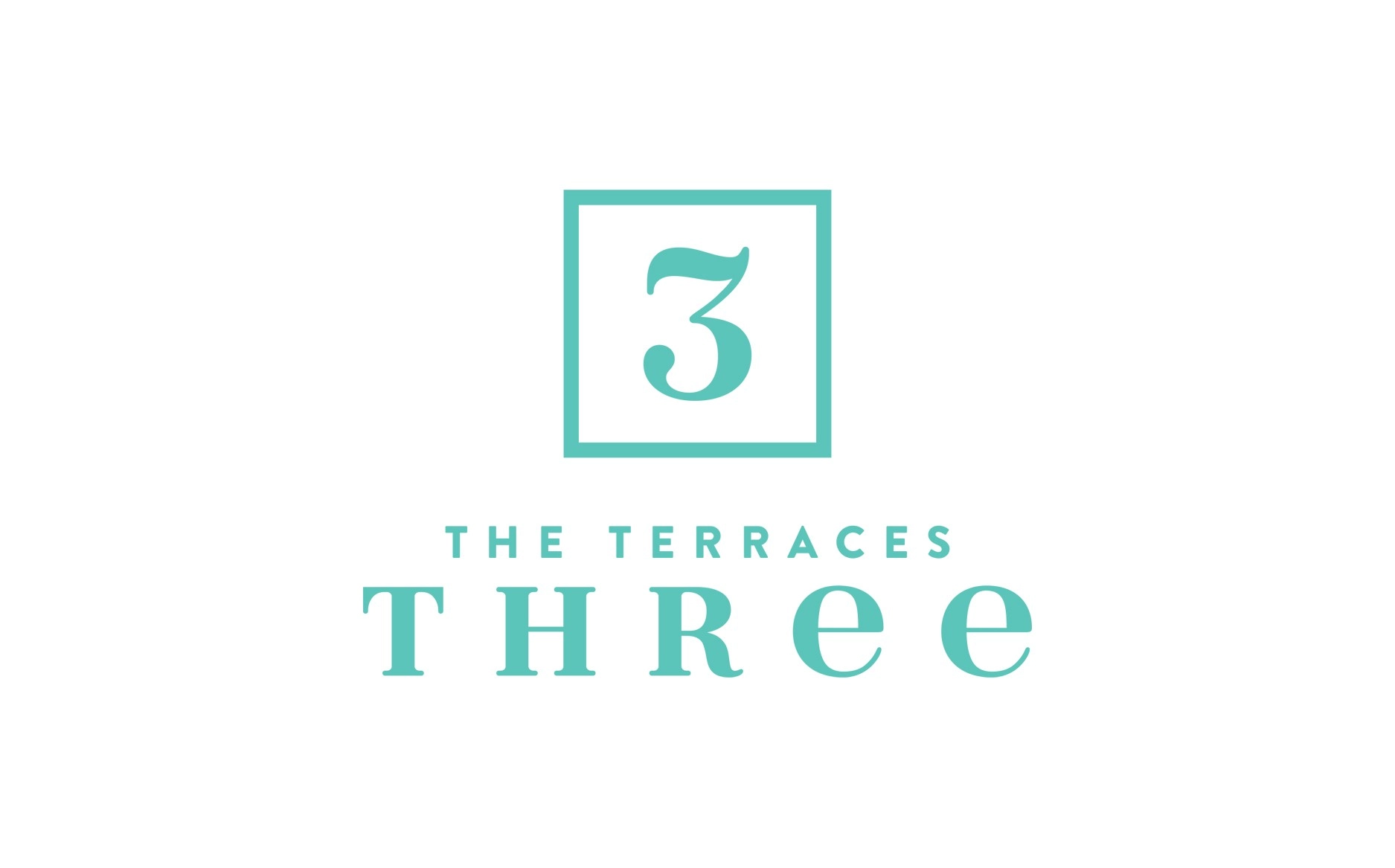
This time around, the new owners of the project provided me with a lot more creative freedom to choose my own colour scheme and design direction. For the redesign, I chose a deep turquoise with gold to give it an elegant, upscale feel, changed the logo slightly to allow emphasis to be on it being the third phase, and tweaked some of the existing marketing materials. As the lead designer, I was in charge of floor plans, signage, website, brochure, feature sheets, folders, and advertisements.